Hi again ya’ll. My spreadsheet said that my annual return for 2014 was 5.25%. The PIP that you get for December should confirm your annual return in your TSP account. Mine was pretty much as expected.
Your Personal Investment Performance (PIP) for the past 12 months ending 12/31/2014 is 5.09%.
Does that meet my rules? Yes Sir. No double digit loss on any PIP report. Attempt to earn 7% a year. So I’m happy with that. The mistake I made in October/November was an eye opener and one I will not make again. Below is the report from the TSP and their numbers almost match my reported numbers to the penny.
The S&P 500 on the Daily chart did fire a warning by closing below the CBL. 50 day ma and short term trend still intact. Steady as she goes for now.
We all know that I have been watching the Small Cap like a hawk. So seeing the Small Cap close below the $1064 level on the 31st of December and January 2nd, was a disappointment. Is it a disaster? Not yet, but if will falls through the CBL, 50 day ma, short term uptrend, monthly sell level, and below that last pivot low, then we are in trouble. That last pivot low is $1005. Let’s don’t go there. No warnings on the Small Cap.
Lower prices still continue on the International Index. There is still nothing positive to say about this index, so stay away.
Bonds almost fired a sell on the monthly level in December. See how close price closed to that purple line? But since that point, Bonds have closed higher 5 days in a row. Will it get through that level marked in yellow above? All warnings are now cancelled on Bonds. Steady as she goes.
Going to give ya’ll a little bonus this week and show you how you can see when prices at the gas pump are going to go back up. I will show you the collapse in September and where we are now. Are prices going to steady here or go lower? Let’s peak.
You can see things have been pretty steady in the United States Oil market since 2008. Almost sideways movement and steady prices at the pump. But in September, the bottom fell out. Prices fell 48%. This doesn’t mean we see a 48% drop at the pump but it does show you that prices at the pump are going to go lower each month since last September. So let’s zoom in to the weekly chart.
When you zoom in using the weekly chart it is a little easier seeing the break down in gas prices. The trend line was snapped. Then the 10 week ma crossed below the 30 week ma for a sell signal. You can see all ma’s are free falling and still trying to catchup with falling prices.
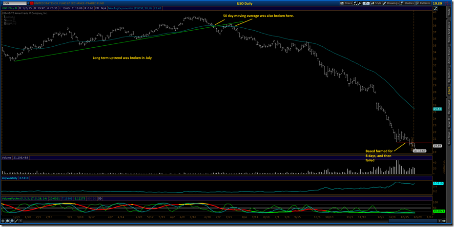
So the last chart on the USO is the daily and here you can see trends starting to break down in July. So all the warnings were there and hardly anyone in the news was saying anything. Now it’s all they talk about. So are prices going lower? Well, look at the lower right of the chart. For 8 days prices firmed up and were holding steady and then they collapsed again. I think prices at the pumps are still going lower for now. How low? No clue, just lower. I saw $1.82 in Front Royal today.
So, if you want to watch prices move on the market and directly affect you at the pump, remember the symbol, USO, United States Oil. If you like this little heads up on oil, let me know, and maybe I will continue to update it so you will know when the party is over. Yes, It will end. The Saudi’s have proven it over and over since 1974.
Have a great weekend.


No comments:
Post a Comment